The Flat File - Smith Home Studios
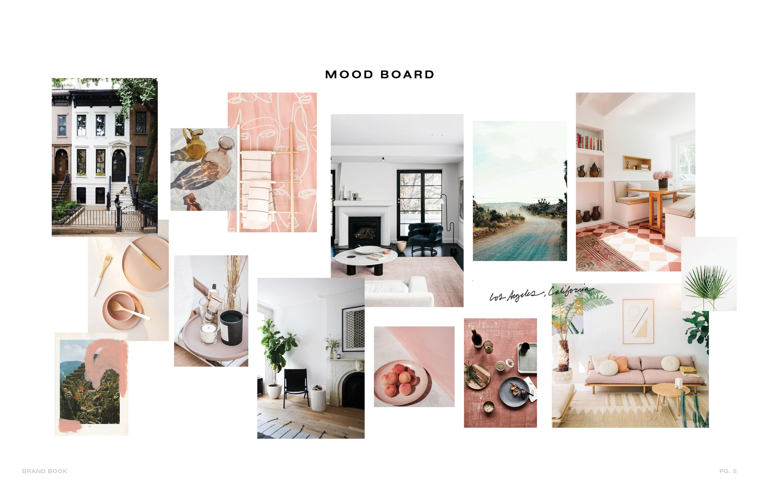
We work closely with our clients to develop their identity and voice, ultimately informing how they engage with the world. Our design process is iterative; a wholly rewarding endeavor in which the client (and we) can take a thoughtful look at what their company is looking to accomplish. Presentational elements—moodboards, copy, logo/mark iterations— are crucial in defining the brand and an integral part of the mechanism by which we build something beautiful, unique and effective.
The Flat File is dedicated to the process.
Jamie Lyn Smith is a designer on a mission. That mission: to build beautiful, immersive spaces. Light and dynamic, Jamie’s work is elegant without being pretentious. Her interiors incorporate a wide range of textures, colors and design concepts that, put together, help to tell a unique story about the homeowner. Jamie shared with us her vision for her company; where she was and, most importantly, where she was going.
To visualize Smith Home Studios as a mark we wanted to build a set of visual layers on a foundation of personal touch. Manipulating typography that conveyed a sense of place and time in a clear and modern way was the lynchpin of all the concepts we presented. We prepared concepts with dark green backgrounds to make the images and pink typography pop or lighter versions with a mix of Parisian and Californian vibes. The end result combines a typeface steeped in art deco proportions with a modern (some would say “millennial”) pink, black text as a masculine balance and subtle handwritten moments.
With a bit of fine adjustment, Jamie– now Smith Home Studios– felt most connected to the second option presented (seen here as page sixteen). It was the option that best matched the mood words (a collection of deeply considered expressions developed by Jamie and Nat) and best encapsulated the intention of the brand. From here, we were able to create individual assets and distribute them over different brand platforms as a system.


